I used to be a content writer for a small web design agency, and my first piece was about website design best practices. I remember my manager going through it and telling me, “All good, but web design isn’t just about making things look good.” Back then, I was young and fresh, and honestly, that sounded totally backward.
Made no sense. For me, design was all about what I saw. I mean, it’s visual, right? So, of course, the look should be everything.
Well, any web designer hearing this would probably be ready to pull their hair out.
“Today, I get it. Front and center, web design is about functionality, user experience, and ensuring every element on the page has a purpose.”
Jenny Romanchuk
So, let’s dive into the top web design best practices for 2024 to make your site do the work — convert visitors into paying clients. I’ll also cover key design guidelines and requirements that you should keep in mind, too.
1. Select a typography that’s easy to read and skim.
Typography refers to how letters and characters (type) are arranged and presented on the page. Since website typography affects not only how we read but how we feel about text on a web page, it’s important to pick carefully.
Ideally, you want a typeface that is:
- Easy to read
- Easy to skim
- Accessible to all users
- Legible across multiple devices and screen sizes
You also want it to match the look and feel of your brand.
For example, the luxury fashion brand Burberry refreshed its logo for the first time in 20 years in 2018. It replaced the old serif typeface with a bold, all-caps, sans serif typeface and dropped the knight emblem.
The result was a simpler and more modern-looking logo that’s easier to read on any screen — and that reflects changes in the company to become more transparent and appeal to a younger generation.

But then, in February 2023, creative director Daniel Lee introduced Burberry’s new logo again. This time, we’re talking about something completely different — a modern blue design that nods to its British heritage.

Why did this change happen?
Fashion brands often refresh their logos when a new creative director steps in, reflecting their vision. When Lee joined in October 2022, he aimed to honor Burberry’s past while embracing the future. He called the logo “a modern take on British luxury” and “a new chapter for the brand.”
While I personally liked the first version a bit more, the second logo and its typography have a story and meaning.
2. Be mindful of auto-translation.
Test how auto-translation will affect your site’s content.
Many users will rely on translation tools to navigate your site, so ensure your design doesn’t create confusion or miscommunication. Pay attention to layout, spacing, and typography — translated text must fit well and remain legible.
Let’s bring it to life.
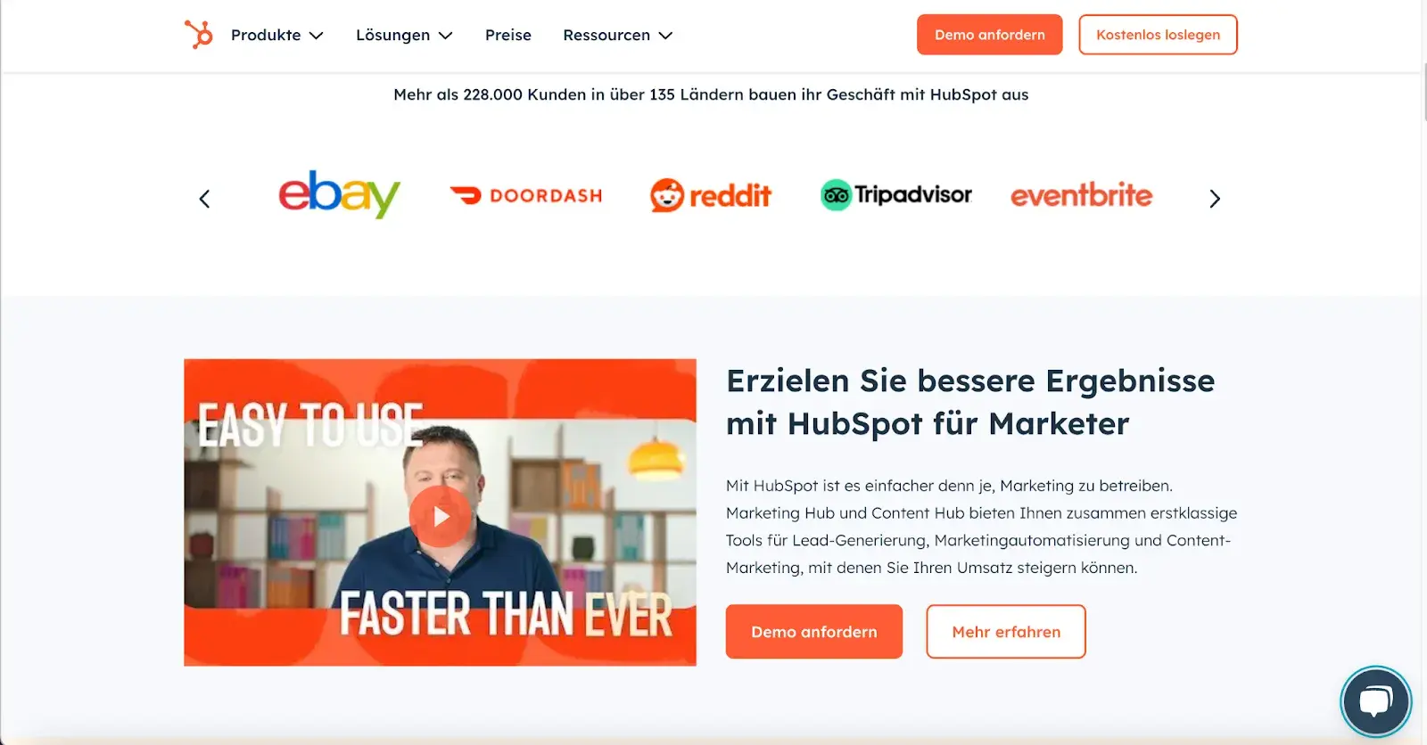
I translated HubSpot’s site from English to German. The result? A polished translated site with no extra spaces, weird letters, or structural issues. Everything looks neat, just like the original:
“At Wrike, we use TT Norms Pro for its clean, modern aesthetic and readability across devices — accessibility is essential. It’s neutral, builds trust, and has multilingual character sets, so materials look polished even after translation,” shares Elisa Daniela Montanari, head of organic growth and website strategy at Wrike.
According to Montanari, a great font should be adaptable to different platforms, pages, and audiences.
“With TT Norm Pro‘s clean lines, it doesn’t compete against our visuals and messaging but complements it,” Montanari says.
3. Choose a color scheme that suits your brand.
Like typography, color can affect not only how we understand and interact with content but how we feel about it. Your color scheme should, therefore, check off the same boxes as your website typography. It should:
- Reinforce your brand identity.
- Make your site easy to read and navigate.
- Evoke emotion.
- Look good.
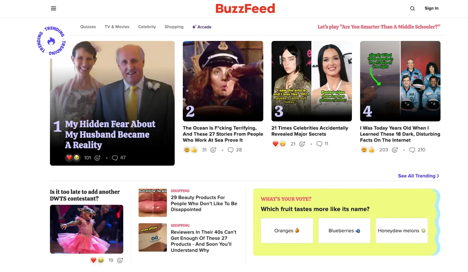
Buzzfeed, for example, uses the primary colors yellow and red to grab users’ attention and get them excited about the content. It reserves the use of the primary color blue — which is associated with trust — exclusively for links and CTA buttons. Both emotions are ideal to evoke for a media site.
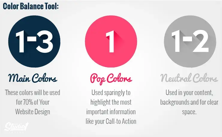
I recently came across a great piece by Greg Merrilees, CEO and Founder of Studio1 Design, highlighting the importance of finding the right balance.
He suggests considering color harmonies — when picking a color palette, start with your dominant color and then layer it. Darker colors grab attention first and carry more visual weight, so you’ll want to move back to lighter colors from there.
4. Use white space to break up text and other elements.
Whitespace provides users with visual breaks as they process a website’s design or content, which is aesthetically pleasing but also offers other benefits.
By minimizing distractions, whitespace makes it easier for users to focus, process information, and understand what is important.
That means you can use whitespace to avoid causing information overload or analysis paralysis — and to emphasize important elements on the page.
This might help persuade users to take a specific action, like sign up for a newsletter, shop your latest collection, and more.
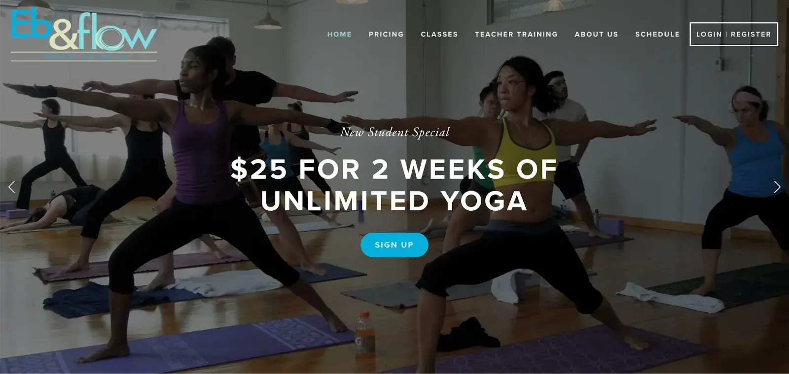
For example, Eb & flow Yoga Studio uses whitespace to lead users toward a specific action: to sign up for three weeks of classes. Notice that whitespace doesn’t mean the absence of color or imagery.
Instead, it means that every element on the page is positioned strategically, with lots of space in between, to avoid overwhelming or confusing visitors.
One of the best insights I’ve come across on this topic comes from Sean Lee-Amies, CEO and founder at Square One Digital, who explained it perfectly.
“Take Google for example. They’re massive. There’s no end of things they could talk about, and yet the only thing on their homepage is a logo, a search bar, and two buttons,” Lee-Amies says.
“Whitespace is always the first casualty of a web design created by people who haven’t yet learned to use a less is more approach to content and communication.”
5. Use texture to add personality and depth.
Resembling a three-dimensional, tactile surface, web textures aim to replicate the physical sensation of touch with another sensation — sight.
They’re a great design alternative to solid color backgrounds, particularly if you want to add personality and depth to your site.
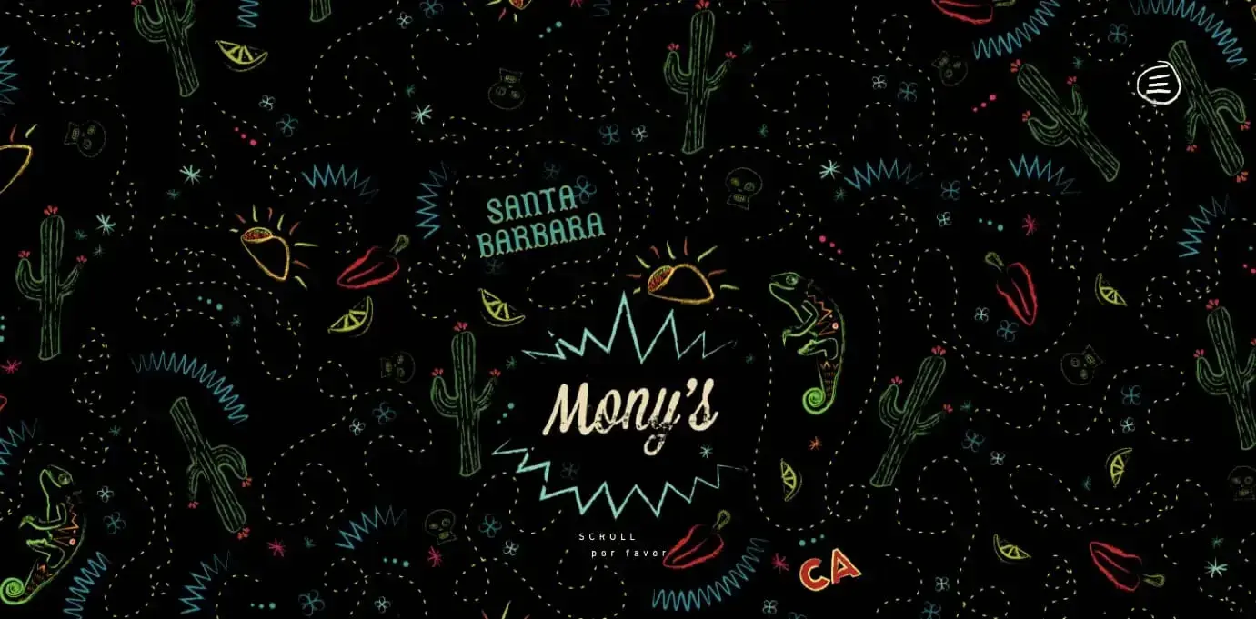
Take a look at the texture on the homepage for the Santa Barbara-based restaurant Mony’s Tacos below.
It looks like chalk drawn on a blackboard, doesn’t it?
I don’t know about you, but I can almost feel the chalk on my fingers just by looking at it. It‘s the perfect look for a restaurant that aims to be California’s preferred Funk Zone choice for Mexican delights.
6. Add images to engage and inform readers.
Striking a balance between text and images is essential in website design. Incorporating visuals can make your content more informative, engaging, and memorable. It’s easier for some people to learn and process information visually.
Here‘s a unique example of breaking up text with images from a cosmetic company’s website. This shows how endless the possibilities of incorporating imagery into your website design are.
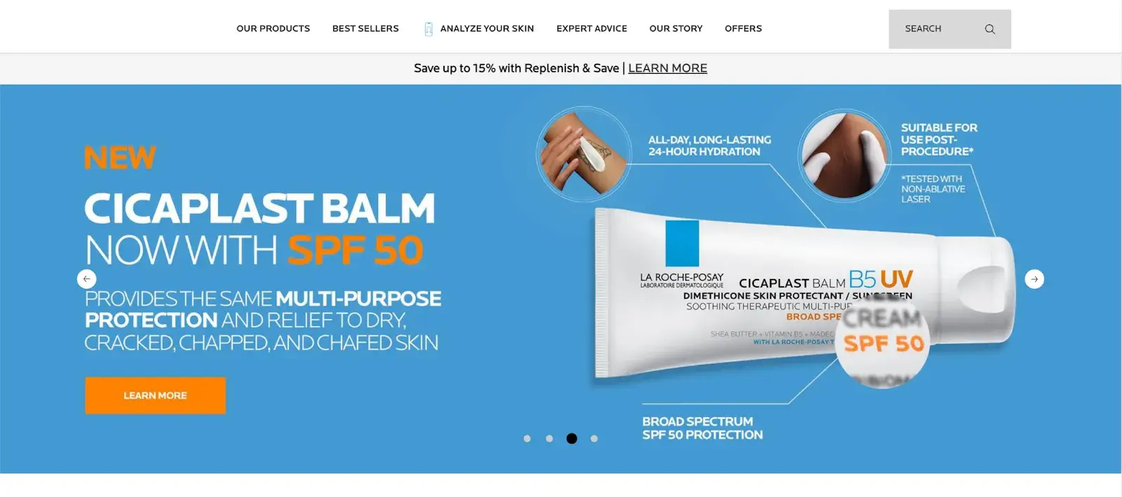
Images should be part of your entire website, not just the homepage, but must be used carefully and in balance.
The design team at Dgtl Infra, for example, creates blog posts with images every 200-300 words and sees 40% more shares than text-heavy articles. They aim for a 60/40 text-to-image ratio.
This balance keeps readers engaged without sacrificing substance. The team uses a mix of infographics, product shots, and relevant stock images.
Every image should serve a purpose. Randomly inserted visuals can do more harm than good. Each should either illustrate a point or provide a visual break at a natural pause in content.
7. Simplify your navigation.
Navigation is one of the most important design elements on a website. It impacts whether visitors arrive on your homepage and browse or click the “Back” button. That’s why it’s important to keep it as simple as possible.
Many websites opt for a horizontal navigation bar. This navigation style lists the major pages side by side and is placed in the website header.
Take the navigation bar on Blavity as an example. The main navigation categories (Entertainment, Culture, Small Business, Blavity U, Blavity Brands, Digital Cover) are clearly labeled and easy to notice.
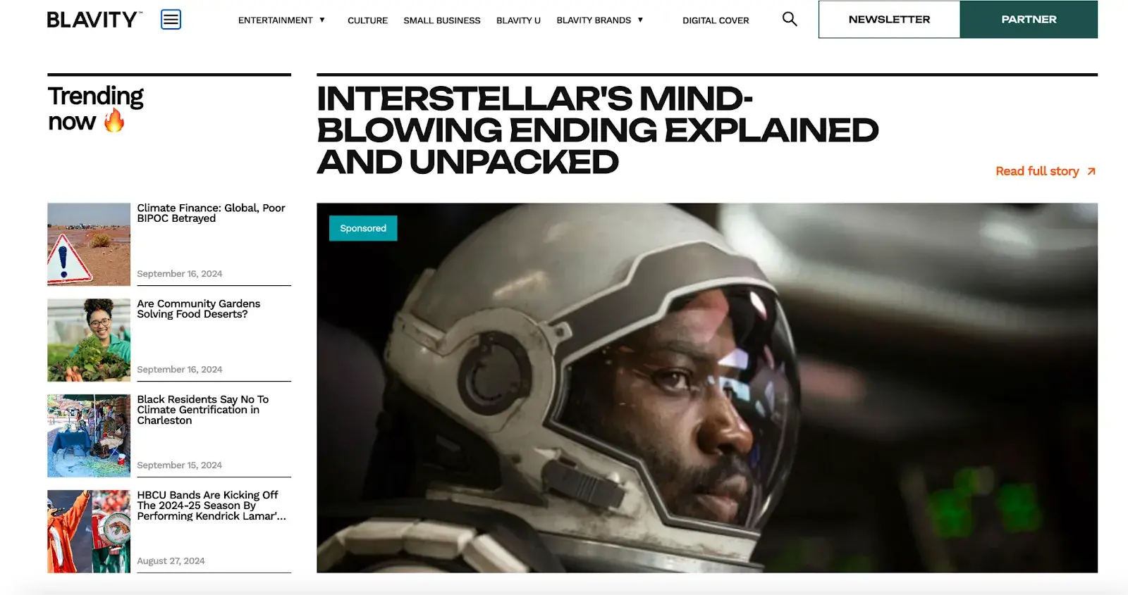
The use of a dropdown menu for the “Blavity” category adds a layer of organization without overwhelming the user with too many options at once. This is a subtle visual cue that helps to guide the user’s navigation.
The search bar found its place in the top right corner, providing a convenient way for users to find specific articles or topics.
8. Make your CTAs stand out.
CTAs are elements on a web page, advertisement, or another piece of content that encourages the audience to do something. The call to action could be to sign up, subscribe, start a free trial, or learn more, among many others.
You want your CTAs to pop in your website design. To make that happen, consider how you’re using color as well as other elements like background color, surrounding images, and surrounding text.
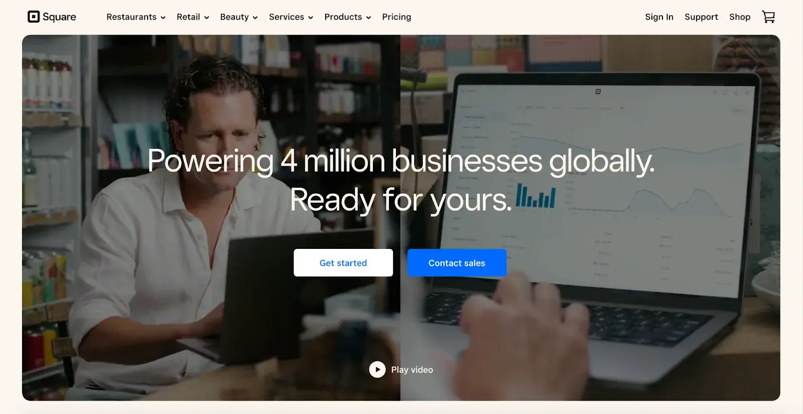
Square provides an excellent call-to-action example. Using a smooth video background, Square shows how unique and future-oriented its product is. Against this dramatic backdrop, the white “Get Started” CTA awaits your click, as well as “Contact Sales” in catchy blue color.
Damon Culbert from Add People also suggests animating CTAs but in balance.
He says that a subtly animated button that wiggles or pulses after a delay can capture attention without being intrusive. Triggering such animations only after a user has spent time on the page ensures the interaction feels timely and relevant.
This technique, similar to well-timed pop-ups, respects the user’s browsing flow while effectively drawing their focus toward conversion.
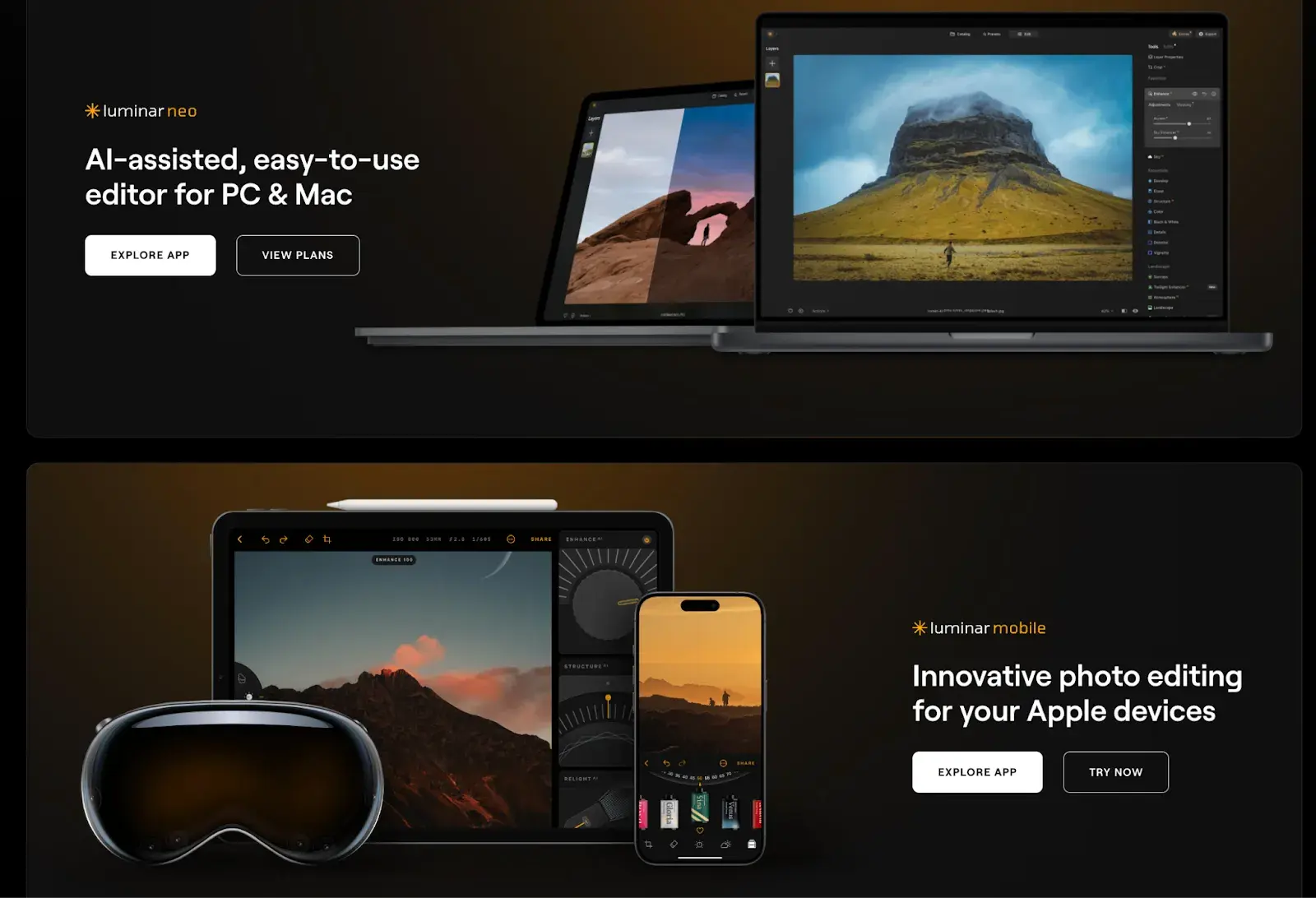
While the design of a button is important, we can’t overlook its content: the text it contains. Yevhenii Tymoshenko, CMO at Skylum, touched on this during our conversation, saying:
“We recently redesigned the layout of our website by placing CTAs at the top and the bottom of the page. We also reworded them to be more actionable. Now they say ‘View Plans’ and ‘Explore App,’ speaking to the customer directly without using pushy language like ‘Buy Now.’ As a result, our conversion rates increased by 12%,” Tymoshenko says.
9. Optimize for mobile.
We’ve already discussed how important it is for your website to be responsive. That might mean altering or removing some elements that would clutter smaller screen sizes or negatively impact load time.
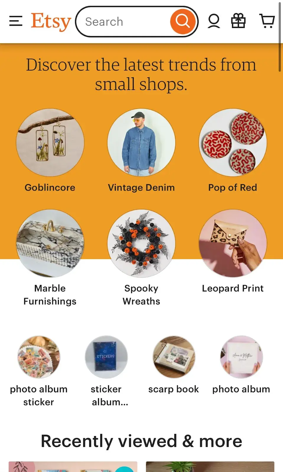
For an example of one of the best website designs, compare Etsy’s homepage on desktop vs mobile. On the desktop, you’ll see a navbar with categories. Hovering over each category will reveal a dropdown menu.
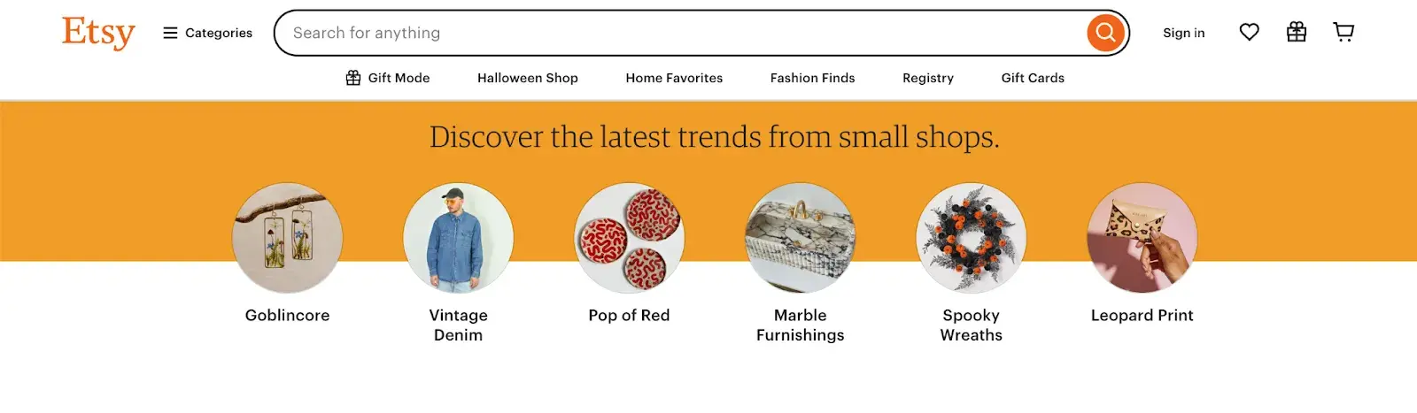
On mobile, this collapses behind a hamburger button, which improves the appearance and performance of the mobile site. You’ll also notice that the images are larger — perfect for tapping with your finger on a mobile screen.
Claire Escobedo from Online Optimism says that one of the main mistakes she sees in mobile design is a lack of accessible features. This includes things that violate WCAG standards and features like hover effects that impact a site’s functionality.
She continues, “You can’t hover on a phone! You have to account for mobile interactions when designing for any site accessed on a mobile device, which these days is pretty much all sites.”
According to Escobedo, just because your site navigation functions well on desktop doesn’t mean it will transfer to mobile.
“A beautiful mega menu is nice for a laptop user, but how is a mobile user going to access those same four tiers of links?” Escobedo notes.
Escobedo notes.
10. Limit the options presented to users.
According to Hick’s Law, increasing the number and complexity of choices will increase the time it takes for a person to make a decision. This is bad news in website design.
If a website visitor is presented with too many options, they might get frustrated and bounce — or they might pick an option you don’t want, like abandoning their cart. That’s why it’s important to limit the number of options presented to a user.
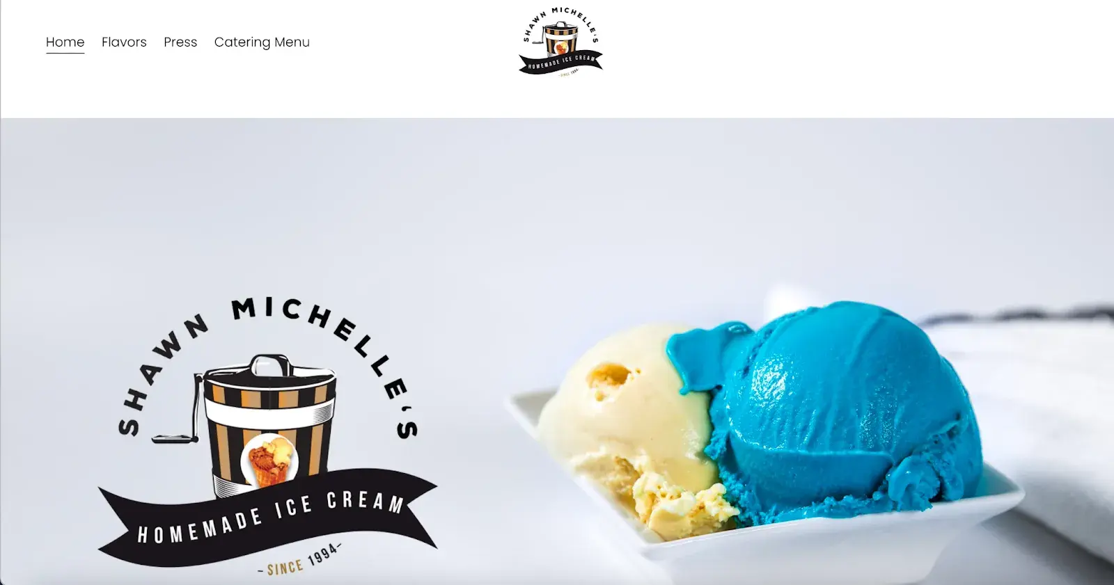
For example, when a visitor lands on Shawn Michelle’s Ice Cream homepage, they have three clear options: learn about the company, explore the flavors, or check out the catering menu.
It‘s clean, with all the key info easy to find. Does a site like this need anything more? Absolutely not. Everything’s right there, making it easy for customers to get what they need, reducing the chance they’ll leave frustrated.
This is a perfect example of Hick’s Law in UX design.
Pro tip: Don’t have the time to follow the rules? You can always download a pre-built website template that will provide a sound foundation for your site.
11. Prioritize functionality over aesthetics.
“Design should support content and functionality — not the other way around. The vast majority of users are going to your site for the information that’s there, not for the way it looks.
As a designer, I know how great it is for a website to look nice, but it can never come at the expense of making sure that your website is functional and understandable for all users.” says Escobedo.
Concentrate on functionality instead of just aesthetics. Create solutions that are easy to use, dependable, and practical, putting the needs of users front and center.
12. Choose the content your users understand.
Website content should be straightforward and doesn’t require all your brainpower to get it and deliver value at the same time. Since that’s not an easy task at all, I hit up Damon Culbert again for advice:
“In order for people to spend time and energy doing something, like sit and read through all the features of a new product or service, you have to create a compulsion within them to do so,” Culbert says.
According to Culbert, strong visuals allow people to invest time and energy into learning more about something you want to sell.
“B2B services are a great example of this; they’re often very complex, and non-experts don’t understand them. It might take a non-expert an hour or more of reading just to get a basic understanding,” Culbert says. “Or they could look at a visual that gets them there in five seconds or less.”
A good example is BuzzSumo’s homepage. It delivers a clear, concise message with visuals like magazine excerpts and social media screenshots, making it obvious what they do — even for first-time visitors.
My final point: People don’t spend money on things they can’t understand if they add value or not. This is why commercially successful companies invest in marketing and sales intelligence tools, mapping out their customer’s buyer journeys and hiccups along the way.
Now, you could spend years studying the ins and outs of web design.
But for the sake of giving you a jumping-off point, we’ve assembled a list of the fundamental guidelines and best practices you can apply to your next website redesign or website launch.
Source (s):
12 Web Design Best Practices & Guidelines for Usability in 2025


