
Being part of the Microsoft Power Platform Landscape, Power Apps is a low-code platform used to create and deploy business applications (Apps) across an enterprise.
Organizations can leverage the power of low-code development to create custom solutions tailored to their needs.
In this article, we will learn about the basics of Microsoft Power Apps and eventually dig deeper into some of its most important characteristics / features via a small step-by-step demo.
I – Getting a Power Apps Account and Environment Set-up
Signing-up for an Account
As described in our previous Power Platform Series article, A Quick Look into Microsoft Power Platform, you can sign-up for a free Microsoft Power Apps Developer Plan account. Below is the link to the Microsoft sign up page: https://www.microsoft.com/en-us/power-platform/products/power-apps/free.

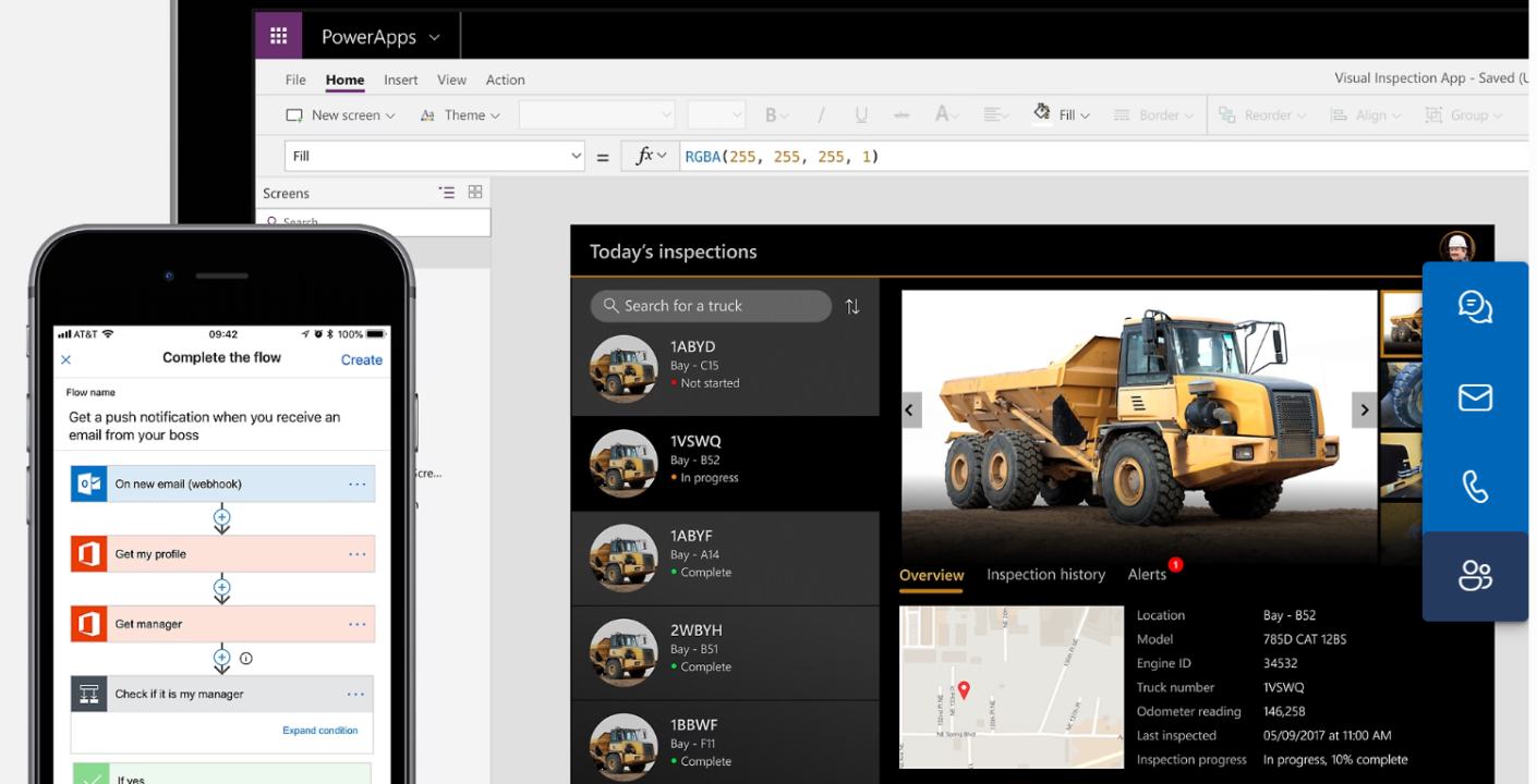
Image Source: Microsoft.com
Environment Set-Up
Once you signed up for an account, a default Power Apps Environment will be automatically generated for you, with the ability to also create your own.
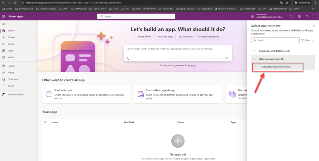
From here, we will guide you in understanding the key elements within that environment. Let’s focus more on the panel located on the far left of the screen. We have the following:
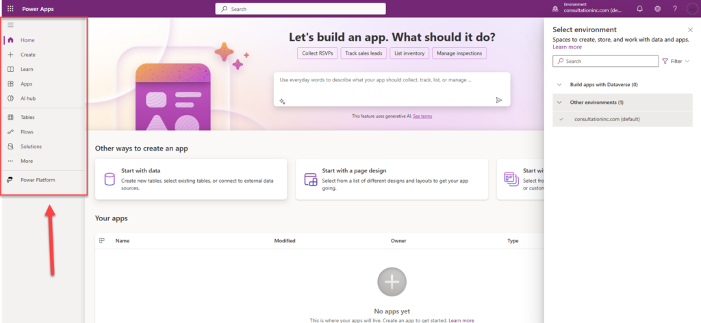
Home: allows you to get back to the Environment main screen
Create: important feature used to create the different types of App
Learn: takes you to the Power Apps learning hub
Apps: lists all the apps that have been created or imported
AI Hub: used to create AI Models in order to optimize your Apps
Tables: to create a Dataverse table (see A Quick Look into Microsoft Power Platform to learn a bit about Dataverse)
Flows: used to create Power Automate Cloud flows
Solutions: important section which holds all the artifacts / objects created for the App
More: presents other Power Apps features such as Connections, Agents, Websites, etc.
Power Platform: allows you to explore other Power Platform products or services.
Also, at the top right-hand side, click on the small icon in the form of a wheel to open the Power Apps Administration and Settings Menu. This section takes care of all billing, configuration / customization, and administration of your Apps as well as that of the entire Power Platform.
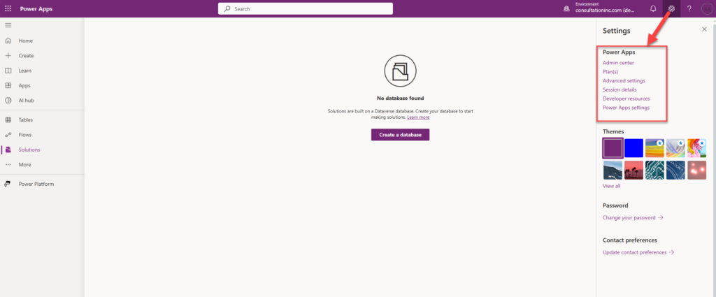
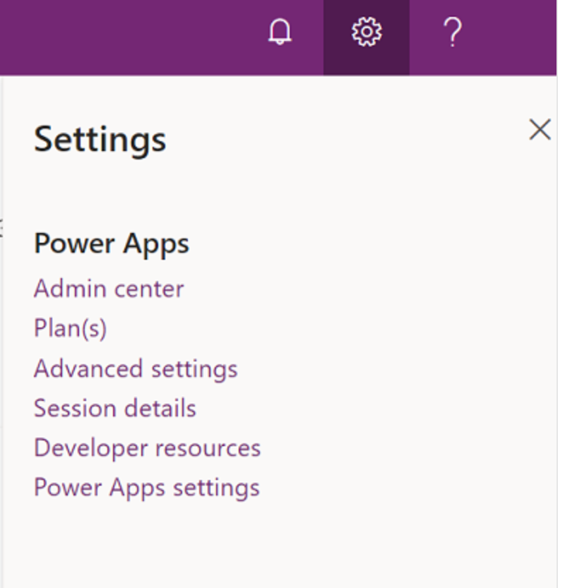
Admin center: Opens another windows and goes to the Power Platform admin center.
Plans(s): View your licenses.
Advanced settings: Manage your admin settings.
Session details: View your Power Apps session details such as session ID, tenant ID, environment ID and more.
Developer resources: Access developer resources.
Power Apps settings: View or update your language and time settings, notifications, or access directories.
Source: Microsoft.com
Resources needed for the DEMO
For every application, we need data. In this demo, we will use an Excel file containing real estate data about Properties and Property Types. You can download this file along with an image / logo here and save them locally as they will be referenced by our App. For the logo / image, feel free to use your own.
Now that we are acquainted with the development environment, let’s go ahead and create our first App.
II – Creating your First Gallery
Before we get hands-on, it is important to distinguish between the different types of App as this will determine what features will be available during the development process. We have two main options when creating apps: model-driven apps and canvas apps.
Model Driven Apps: are built on top of a Microsoft Dataverse Database. It is component / data model driven which is mostly suitable for creating Apps on top of other application’s data streams (Ex: Microsoft Dynamics Sales, CRM, Field Services, etc.). However, It offers less room for customization.
Canvas Apps, on the other hand, can be built with or without a Dataverse database offering a huge opportunity for heavy customization. Our demo will use the latter.
Below is a step-by-step guide in displaying a certain amount of data from the above file using a Gallery Control.
Step 1: From the left hand side Menu, Click on Create -> Start with a blank convas -> Responsive
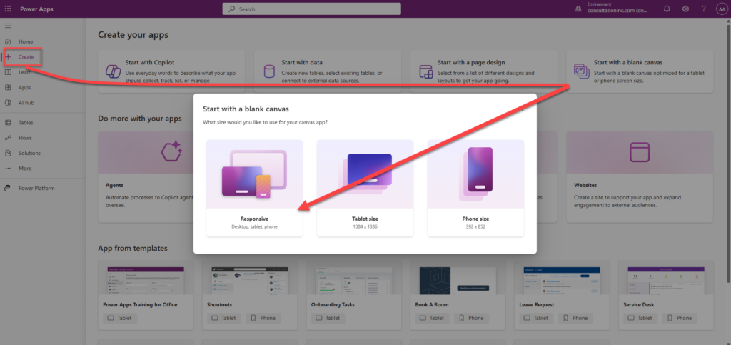
You will be asked to create the App from a Form or from a Gallery. Click the “Skip” button to move to the next screen.
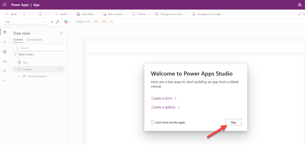
An empty interface (Screen) resembling a web site layout with some elements (Header, Footer, Main, etc.) is automatically created for you. We will need to customize this to our needs.
Step 2: Adding and Customizing a new Screen / User Interface (UI)
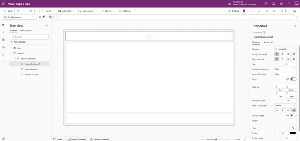
As we can see on the left, we have a set of icons which offers the following:
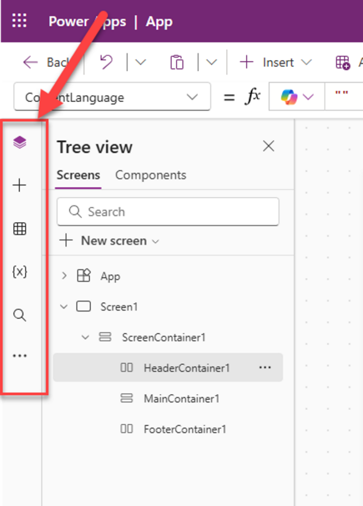
Tree view: displays the list of controls used in the App that we will be customizing
“+” Insert: presents the various control that can be used to create the App
Data: allows us to import data into the App
“{X}” Variables: to create variables used in formulas
Search: to search / replace components in your App
“…”: to access more functionalities (ex: Media, Power Automate, etc.)
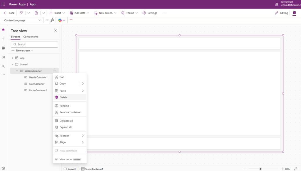
First, let’s delete those things created automatically for us. Then we will add a new screen tailored to our needs.
Screens are small pieces of Graphical User Interface which make up an App (Ex: Login Page).
From the Tree view, Right-click on ScreenContainer1 -> Press Delete. Notice that we won’t be able to delete Screen 1 until we add another Screen.
Navigate to the top center, click New screen -> Choose Sidebar auto layout screen
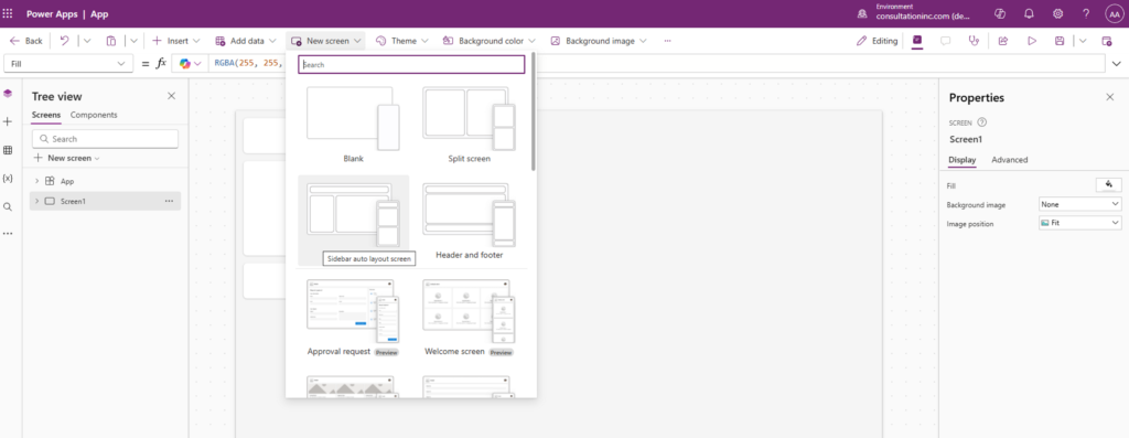
Select the old Screen 1-> Right-click it -> Then delete it.
Rename our new screen “Properties Screen” using the 3 dots next to the screen name.
Rename the ScreenContainer2 to “Screen Container”
Rename the HeaderContainer2 to “conHeader”
Rename the BottomContainer2 to “conContent”
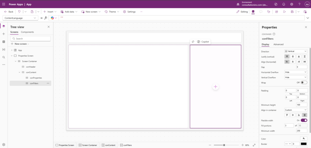
Rename the SidebarContainer2 to “conFilters”
Rename the MainContainer2 to “conProperties”
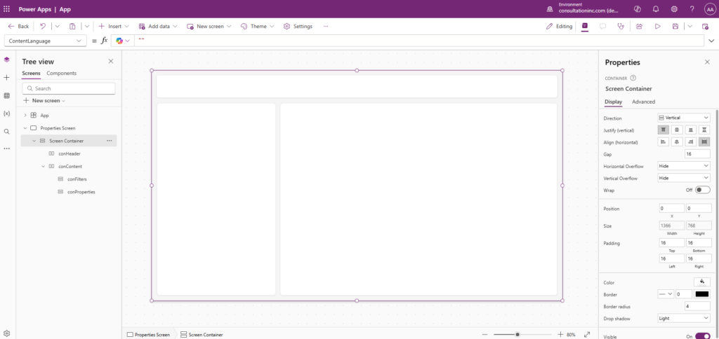
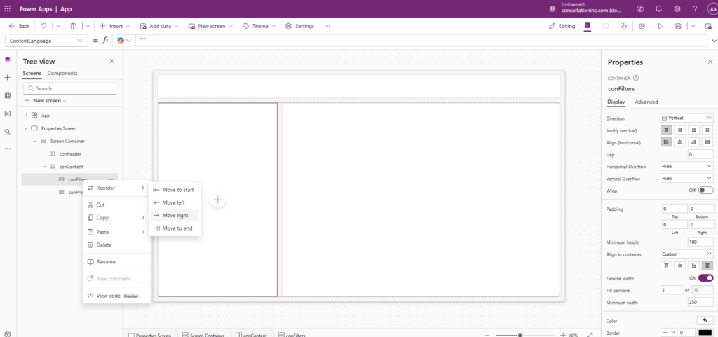
Let’s shift the conFilters to the right by Right-clicking on conFilters -> Choose Reorder -> Move Right
Step 4: Accessing and importing the data
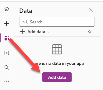
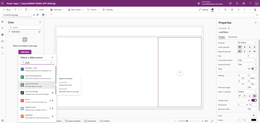
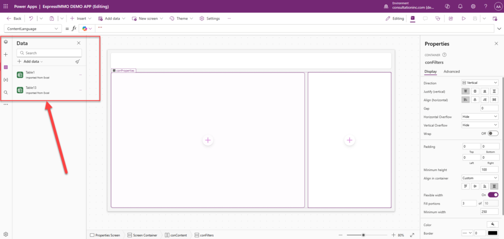
Remember that spreadsheet we downloaded earlier? Well, it is time to retrieve it and bring it into our App. So, let’s click on the Data icon from the far left menu -> Add data -> Search for the Excel Connector.
A connector allows you to connect to a particular source system / data source from Power Apps and extract its data.
Click on “Import from Excel” then navigate to the location of the file to bring it in.
The file is comprised of two (2) tabs: Property_Info and Property_Type. Each tab is represented as a Table in Power Apps. Select the 2 tables then click on “Connect”.
It is time to find a way to display that data. Before we do that, we will play a little bit with the screen / user interface to spice up our App and introduce Controls in Power Apps.
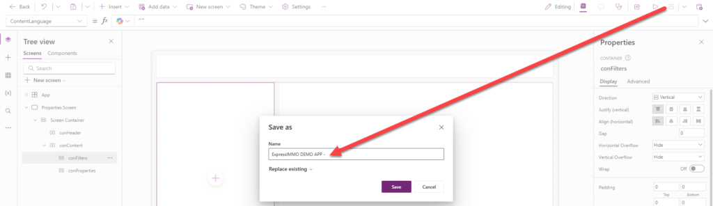
Step 3: Saving our accomplishments so far
From the top and far right hand side, click on the save button and type “ExpressIMMO DEMO APP” as a name then click Save.
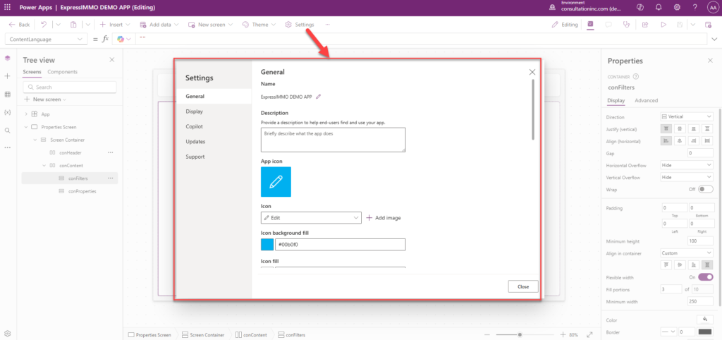
You can still rename your App after you saved it by clicking on “Settings” from the Top Menu to open the Settings Dialog Box where you can perform more customization for your App.
Step 5: Customizing the Header
Since we already have the layout of the header when we created the Screen (See Step 2), we can add more items / controls to make it more presentable.
A control is a pre-defined object in Power Apps which can be used to add a feature or a behavior (Ex: a Button, an Image, an Input Text, etc.)
We will add an image / logo, a Title, and the Current User Controls to the App.
Navigate to the far left Menu -> Click on the 3 Dots (…) -> Click Media -> Add media -> Upload
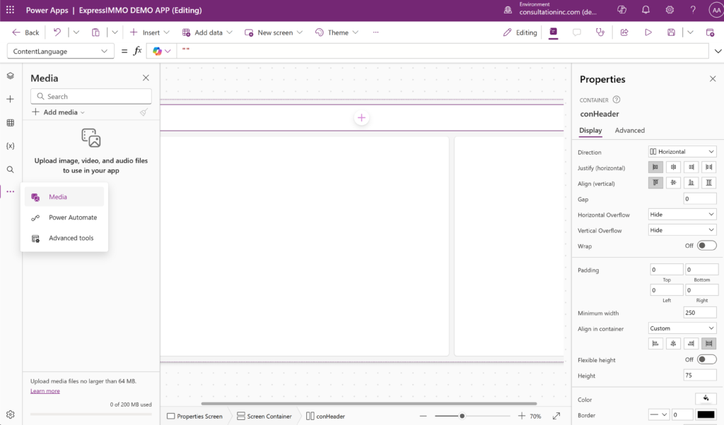
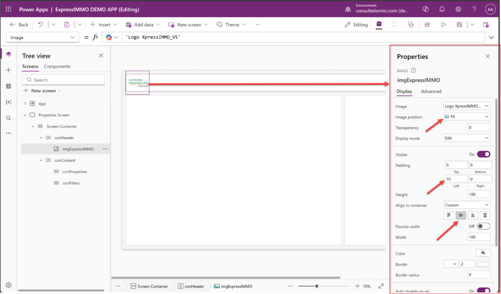
Go to the Header, Click on the (+) -> Choose the “Image” control -> Right-click on the image -> Edit -> Existing media file -> Choose the logo you just uploaded.

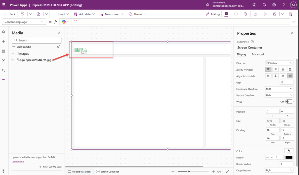
Next, we will position our image / logo using the “Properties Panel” on the right. It is the section used to customize a control. It is important to play around with this panel to get a better understanding of it.
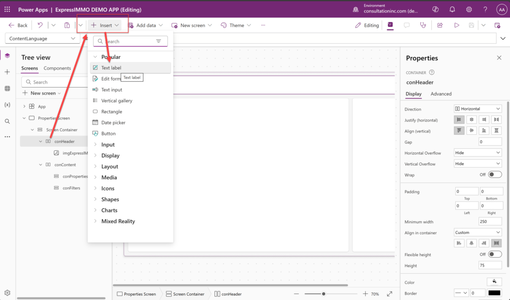
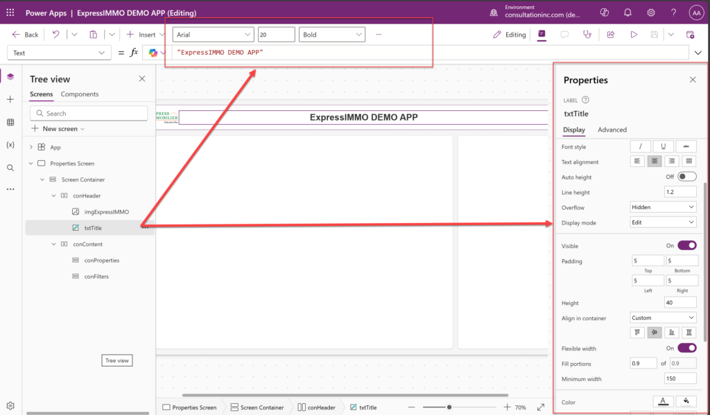
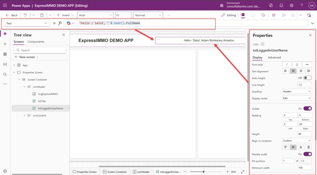
We will now add a title for our App.
In addition, we will add the user presently logged into the App. This will require using the Power Apps built-in code library which offers functions / formulas that we can leverage to do more complexe customizations.
Insert another text control and position it to the far right in the header -> Set the properties -> add this piece of code inside the Formula Editor from the top right below the Menu:
“Hello / Salut, ” & User().FullName
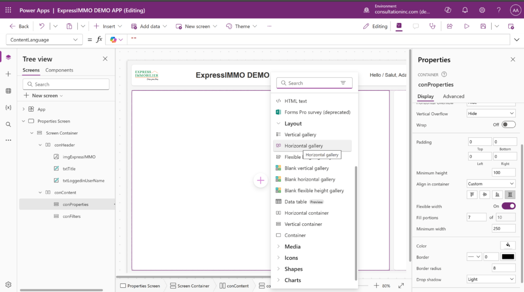
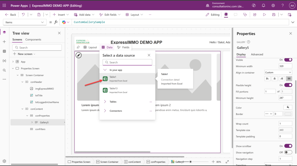
Step 6: Let’s finally show our data using a Gallery Control
Select the conProperties Container -> Click the (+) -> Layout -> Horizontal gallery -> Choose Table1 as the data source
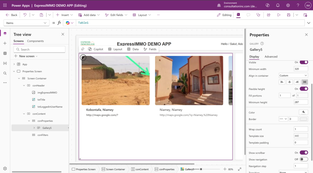
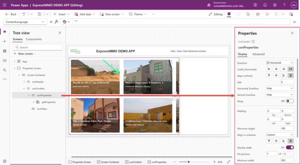
We would want to modify the above gallery to show not only the information that we want from the data source as well as the format in which it is displayed. Let’s play around with the Columns / Fields of the Gallery from the Properties Panel. We will need to set the properties of the conProperties control as well.
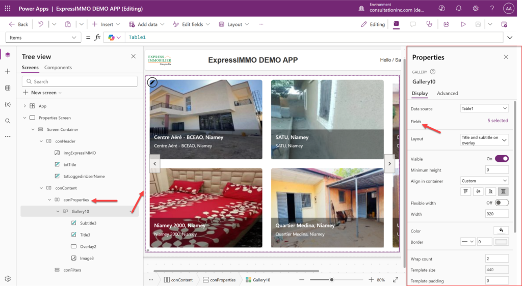

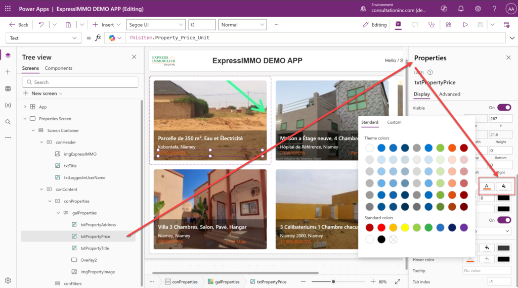
We will start by choosing the fields that we need, then copy and paste one column from the left panel under the Gallery Control (galProperties) to have a fourth column that we will rename txtPropertyPrice
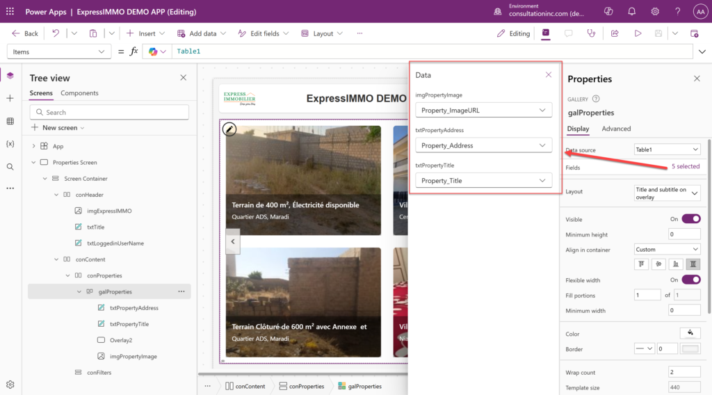
The new column will be overlayed on top of the txtPropertyAddress column (the one we copied it from) in the gallery display. So, we need to drag it a little bit further down so it becomes visible then rename it. We will assign it to the Property_Price_unit field from the data source using the Properties Panel.
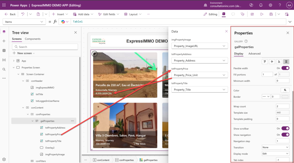
Let’s change le color of the price field (just flexing our muscles a bit now 🙂 ) by selecting the txtPropertyPrice Column -> go to its properties -> then select the font and change the color.
Step 7: Running / Executing the App
Good. Let’s run the App and see the result of our work by clicking on the “Play Button” located right of the menu from the top.
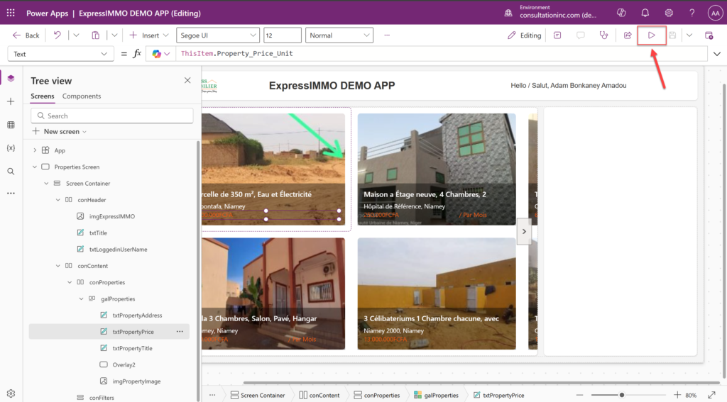
Notice that we have two arrows on the left and right hand side of our displayed properties which allow us to navigate from a set of properties to another just like a next page and previous page button.

To Exit the App and go back to “Edit Mode”, click on the (X) Button located at the top right of the screen. That’s it.
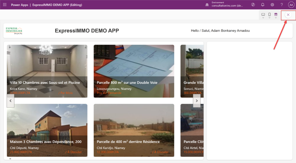
However, the far right section of our App is still empty and looks like an UNFINISHED BUSINESS. It would be nice to have some filters in that area to make our App even better by adding more interactions. Well, that will be the topic of our next article from the Power Platform Series. We hope you enjoy this DEMO. Thank you and Stay Tuned !

By ADAM BONKANEY AMADOU
Executive Director / Certified Solutions Architect
abonkaney@consultationinc.com
www.consultationinc.com


